Dashboard page
The dashboard page gives you some useful widgets you can use, see below for more details about the available widgets
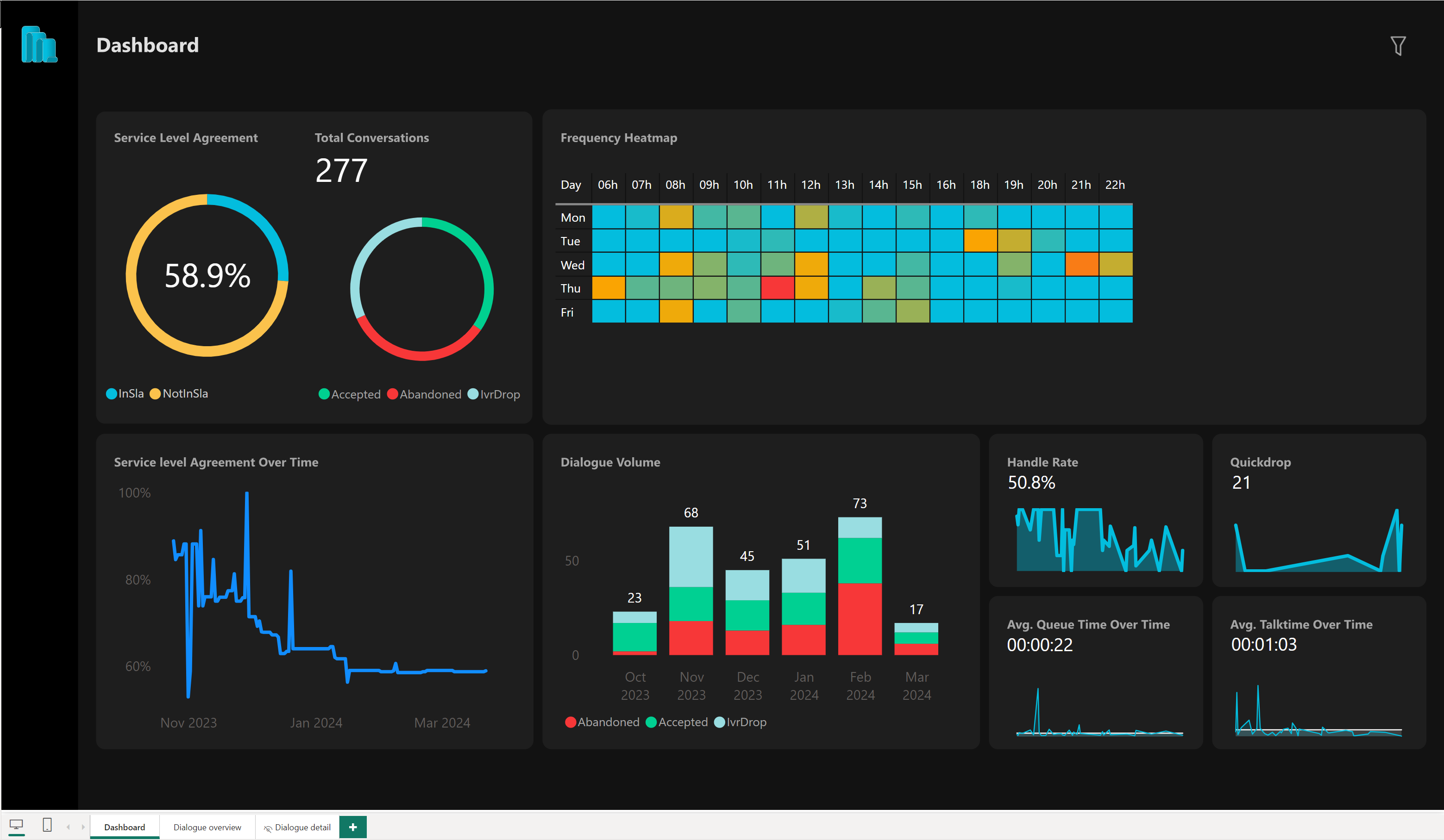
Which metrics are reported?
|
Widget |
Description |
|---|---|
|
Service Level Agreement |
This widget shows two things:
SLA is based whether the accepted inbound Dialogue was accepted by an Agent within the configured 'slaThreshold'. |
| Total Conversations |
This widget displays the number of dialogues using counter and a donut chart, with the data being segmented by outcome type. The different outcome types are shown in the legend.
|
| Frequency Heatmap |
This heatmap is a table that uses a color range of boxes to visually represent the volume of dialogues over the course of a week. The color blue indicates that there are no dialogues, while red indicates the highest volume of dialogues. The table is organized with the rows representing each day of the week, and the columns representing the hours of the day. If there are no dialogues on a specific day or hour, then that row or column will not be displayed in the table. |
| Service level Agreement Overtime |
This visual displays the percentage of dialogues that are within the Service Level Agreement (SLA), excluding IvrDrops, compared to all dialogues over a period of time. The y-axis represents the percentage of dialogues, while the x-axis is divided by date. This allows you to see how the percentage of dialogues within SLA changes over time. |
| Dialogue Volume |
This widget displays a stacked column chart that shows the number of dialogues received over time, with the data being segmented on a monthly basis. Additionally, the widget provides the ability to divide the data by outcome type, which is displayed in the legend.
|
| Handle Rate |
This widget provides two different visual representations of the percentage of accepted dialogues compared to missed dialogues over time.
|
| Quickdrop |
This widget displays two different visual representations of the number of dialogues that were marked as quick drops.
|
| Avg. Queue Time Over Time |
This widget provides two different visual representations of the average queue time for accepted dialogues.
|
| Avg. Talk Time Over Time |
This widget provides two different visual representations of the average talk time.
|